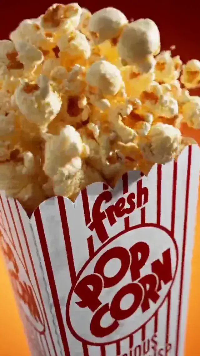
P—09 / TEN-CUT POPCORN AD

CGI product commercial prompt for MiniMax H3

Ten cuts in eight seconds. Every one of them has a start time written down.

The most tightly scheduled prompt in the library: ten shots across eight seconds, each with an explicit start and end, each with its own camera move and its own lighting. It is the opposite discipline to the sequence-word approach used elsewhere on this site, and this page is about when that trade is worth making.

Steps
2 steps
Mode
Image to Video
Duration
8s
Ratio
3:4
Resolution
2K
Audio
Percussive foley + music bed
Cost
$1.04

Reference render — not generated on this site. Source: pollo.ai

Output reference

A striped cinema popcorn box overflowing with popcorn on a red backgroundImage
Step 01 — the still
A striped cinema popcorn box on a red background in a fast-cut CGI commercialVideo
Step 02 — the clip

JPG · PNG · WebP · HEIC · 30 MB

2597 / 7000

Images 0/9 · Clips 0/3 · Audio 0/3 · 12 files max

No card, no account: watch and download 12 real MiniMax H3 clips, and run one prompt of your own on Agnes Video V2.0 — 16:9, watermarked, once. After that, sign in free for 3 clips a day on the free engine. MiniMax H3 on your own prompt starts at $24.9 a month.

1 FREE CLIP · WATERMARKED

02 — Inside

Two prompts, one workflow

Each step is the result beside the text that produced it. Copy either prompt into the console above.

Reference output, step 01
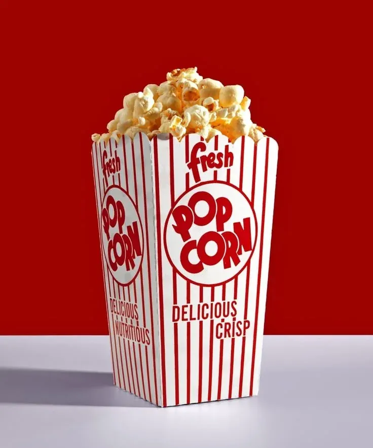
A striped cinema popcorn box overflowing with popcorn on a red backgroundImage
The still
Step 01the stillAny image model
1,313 chars

The pack

A clean hero of the pack, lit and shaped so that ten different camera moves can all find something to land on.

Photoreal studio product photograph of a classic cinema popcorn box, vertical 3:4.

PRODUCT:
A tapered rectangular card popcorn box, wider at the top than the base, in bold vertical red-and-white stripes. On the front face a large white circle containing the words "POP CORN" in heavy rounded retro lettering, red, stacked on two lines. Above the circle the word "fresh" in a small italic script. Below the circle the words "DELICIOUS CRISP" in condensed retro caps, arced slightly. Visible card texture, faint print misregistration, one soft crease near the base — a real box, not a render of a mockup.

CONTENT:
Buttery popcorn heaped generously above the rim and spilling slightly over the front edge. Individual kernels crisp and separated, warm cream and pale gold, a few with visible butter sheen and salt grain.

SET AND LIGHT:
The box stands on a pale cool-grey seamless surface against a deep saturated red background. Single soft key from front-left, gentle falloff, faint contact shadow under the base. Even, commercial, high-key on the product against the dark red field.

RENDER:
Sharp throughout, no depth-of-field blur, high dynamic range, no motion blur.

RESTRICTIONS:
No hands, no people, no additional text, no real brand marks, no watermark, no cinema seats, no scattered popcorn on the table.
Paste it into whichever image model you already use. We do not run one here yet — when we do, this button generates instead.

Reference output, step 02

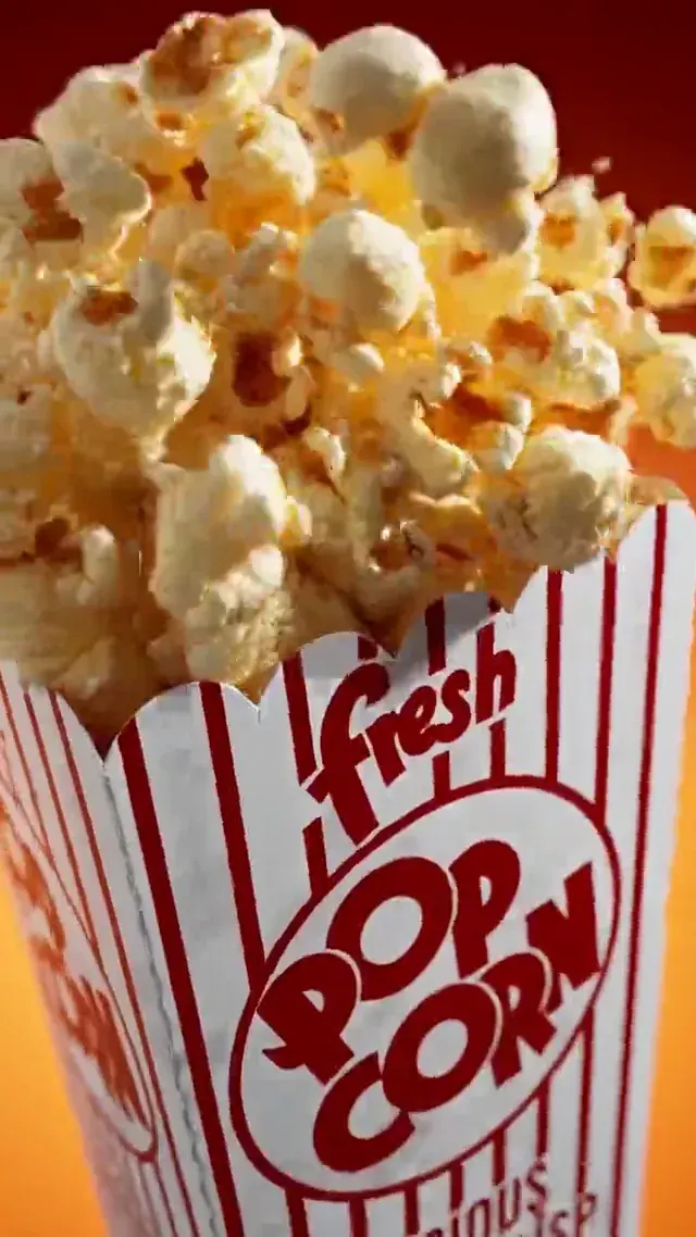
A striped cinema popcorn box on a red background in a fast-cut CGI commercialVideo
The clip
Step 02the clipMiniMax H3 · Image to video
2,597 chars

The ten cuts

Every cut carries its own timecode, camera verb, subject and light. Nothing is left for the model to schedule.

Create a product video ad from [image1].

8-second premium CGI commercial, photoreal popcorn pack matching the reference — red-white vertical stripes, bold circular "POP CORN" logo, retro typography, buttery popcorn overflowing. Dynamic non-white, non-black environments only. 10 cuts total.

Cut 1, 0.0–0.7s, extreme macro of a butter explosion landscape: molten golden butter flows like lava over popcorn textures, micro salt crystals sparkle under warm amber and golden volumetric light, camera glides low with aggressive push-in, shallow DOF turning highlights into creamy bokeh.
Cut 2, 0.7–1.4s, slow-motion popcorn burst: kernels explode mid-air into fluffy popcorn, fragments expanding outward in soft elastic motion, butter droplets suspended, warm red rim light and soft cream fill, cinematic slow motion.
Cut 3, 1.4–2.0s, whip-pan into floating popcorn cluster: dozens of pieces rotating in midair, soft golden highlights, crispy texture catching specular light, buttery gloss shimmering, motion blur streaks in warm tones.
Cut 4, 2.0–2.6s, a butter vortex swirl forms: golden liquid and popcorn crumbs spiral upward in a saturated red-to-orange gradient studio, camera orbits fast with speed ramp, popcorn flying outward like a snack cyclone.
Cut 5, 2.6–3.3s, the popcorn box bursts through the vortex: crisp cardboard crinkle, pack emerges with impact, suspended midair, lit by warm amber key light and subtle red rim light, background shifts to a bold red backdrop.
Cut 6, 3.3–4.0s, ultra macro tracking shot across the box surface: paper texture, ink print details, subtle creases, glossy highlights sliding across the red stripes, camera glides toward the circular POP CORN logo, sharp contrast lighting.
Cut 7, 4.0–4.7s, snap-zoom into the logo area: camera tilts slightly, popcorn crumbs sweep across frame like particles, soft buttery vapour drifting, texture emphasised with tactile realism.
Cut 8, 4.7–5.6s, hero rotation: the box tilts 20–30°, revealing the overflowing top, popcorn pieces shifting slightly, butter sheen glows, background transitions to red then warm orange gradient with soft light bloom.
Cut 9, 5.6–6.8s, flavour payoff impact: a cascade of popcorn explodes outward in slow motion, crispy edges catching light, crumbs and salt particles scattering, one piece lands foreground with soft bounce and crumble.
Cut 10, 6.8–8.0s, final hero shot: box centred, slight forward drift, popcorn gently settling on top, warm golden glow halo around edges, loose crumbs floating upward, premium studio lighting, warm amber key and soft red fill, clean cinematic finish.

4 levers

Make it yours

What is safe to change. Most libraries publish only this list, which is why so many copied prompts come back worse than the original.

  1. 01

    The cut count

    Ten cuts in eight seconds averages 0.8 seconds each, which is at the fast end of what reads. Six cuts is calmer and easier to get right; twelve stops being a commercial and becomes a strobe.

  2. 02

    The escalating cut length

    The early cuts are 0.6–0.7 seconds; the last two are 1.2 seconds. That deceleration is why the ending feels like an ending. If you rewrite the schedule, keep the last cut the longest.

  3. 03

    The product

    Everything here transfers to any packaged food. Substitute the pack in the still and rewrite three nouns — butter, salt, kernels — into whatever your product is made of. The camera schedule does not change.

  4. 04

    The colour instruction

    "Dynamic non-white, non-black environments only" is a single line preventing the default studio infinity curve. It is why the whole film sits in red and amber instead of on a grey sweep.

Three ways to break it

  • Leaving gaps or overlaps in the timecodes

    The ten ranges here are contiguous and exact: each cut starts where the last one ended. A gap tells the model there is unscheduled time and it fills it by stretching a neighbouring cut, usually the wrong one.

  • Changing the duration without rewriting the schedule

    This prompt is written for exactly eight seconds. Request ten and the model rescales every cut, which lengthens the fast opening cuts — the ones that were fast on purpose — and destroys the acceleration.

  • Describing the pack differently from the still

    The video prompt restates the pack briefly and correctly. If that restatement disagrees with the reference image on any detail — stripe direction, logo shape, typography — the model resolves the conflict somewhere in the middle, and the pack changes shape between cut 5 and cut 10.

What it does

What the ten-cut popcorn ad template does

Elsewhere on this site there is a template that deliberately refuses to use timecodes, and this one is its opposite. Both are right, and the difference between them is the most useful thing on this page.

Hard timecodes cost you flexibility. The model can no longer decide that a shot with more texture in it needs a bit longer, which means if your schedule is wrong the output is wrong in exactly the way you specified. In exchange you get control over rhythm, and rhythm is the entire product of a commercial like this one. Ten shots of popcorn are not interesting. Ten shots of popcorn accelerating from 0.7 seconds to 0.6 to 0.6 and then decelerating to 1.2 is a piece of music, and no model will invent that shape unprompted.

The rule is roughly: use timecodes when the cutting pattern is the idea, and use sequence words when the content is the idea. A moody product film with four textured shots does not need a grid. A ten-cut CGI ad is nothing but a grid.

The schedule here is worth reading as a curve rather than as a list. Cuts 1 to 4 run 0.7, 0.7, 0.6, 0.6 — accelerating. Cut 5 is the reveal at 0.7. Cuts 6 and 7 are 0.7 each, holding. Then 0.9, 1.2, 1.2. The film speeds up into the product reveal, holds through the detail shots, and slows into the ending. That is a standard commercial edit and it is expressed entirely in numbers.

Contiguity matters more than people expect. Every range ends exactly where the next begins, with no gaps and no overlaps, and the last one ends exactly at eight. A model reading a schedule with a hole in it has to decide what happens during the hole, and it decides by extending whichever neighbouring shot it found easiest to render — which is reliably the least interesting one.

The one line that does the most work per character is "dynamic non-white, non-black environments only". Without it, a prompt asking for a photoreal product on a studio set produces a white infinity curve, because that is what the overwhelming majority of product photography in any training set looks like. Ten words rules out the default and forces the model into the red-and-amber world the rest of the prompt assumes.

Finally, note the brevity of the pack restatement at the top: stripes, circular logo, retro type, overflowing popcorn. It is deliberately shorter than the still's own description. Its job is not to define the pack — the reference image does that — but to name the four features that must survive ten camera moves.

Everything here runs in image to video.

6 questions

Ten-cut popcorn ad — common questions

  • 01

    When should I use hard timecodes instead of "then, then, then"?

    When the cutting rhythm is the product. A ten-cut commercial needs a grid; a four-shot mood film is better off letting the model distribute the time itself.

  • 02

    How short can a cut be?

    About 0.6 seconds before it stops registering as its own shot. At eight seconds that puts the practical ceiling near ten to twelve cuts.

  • 03

    Do the timecodes have to add up exactly?

    Yes. Contiguous ranges with no gaps, ending exactly at the requested duration. Any hole gets filled by stretching a neighbouring shot.

  • 04

    Can I reuse this schedule for a different product?

    Yes, and that is the point. Swap the still and rewrite the material nouns; the ten-cut curve is product-agnostic.

  • 05

    Why restate the pack in the video prompt at all?

    To name the four features that must survive every camera move. Keep it short and keep it consistent with the reference — a longer restatement invites a conflict the model resolves by drifting the design.

  • 06

    Will the printed text on the box stay stable across ten cuts?

    Short retro lettering usually survives; small print usually does not. That is why the still limits the box to a name and one strapline.

Copy it, change three things, run it.

Every character is on this page. 8s at 2K costs $1.04.

Sign in free · 3 clips a day